Much like my alma mater’s student union in 2016, Citizen Space has a new look. But unlike my student union, who spent £26 000 on a rebrand after a failed engagement campaign, only to be landed with a 1000-strong petition stating how much students hated the new styling and demanding it be changed back within a day of the unveiling, Citizen Space’s new look came about on the back of customer feedback, careful consideration and planning. We call it the configurable hub.
It’s not just superficial, however, although it does look pretty bloody great. With the new hub comes a new set of functionalities for our customers. The clue’s in the title: it’s configurable.
Customers can now customise their hub to display thumbnail images next to consultations, add a second landing page and adapt blocks to suit them.
Here’s what the old landing page looks like:

And here’s an example of how the new one can look:

Over time, we noticed that our customers were and are using Citizen Space for far more than just formal consultation. It’s been used for engagement activities, event feedback surveys, internal staff engagement, voting, and even data collection. Which is, of course, brilliant – but we realised that the standardisation of the consultation hub just wasn’t reflective of that spirit of creativity and inventiveness. So we changed it.
Of course, Citizen Space still is and can be used for consultation, and we haven’t taken anything away from that functionality. The key difference is that the configurable hub allows customers to separate and present information in different ways according to what suits them.
Users can now create dedicated second landing pages, to feature whatever content they’d like. This can be used to create a separation between formal consultation and different types of activity, like engagement.
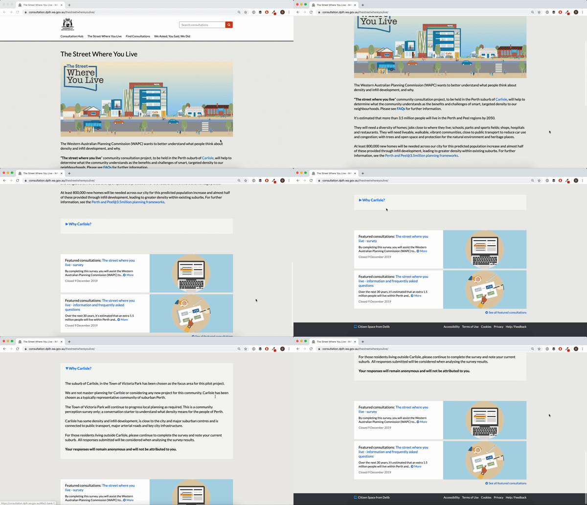
Or it can be a specific consultation project, like ‘The Street Where You Live’ from the Western Australian Department of Planning, Lands & Heritage. They’ve used the second landing page to consolidate all the different components of the wider consultation (public events, quick surveys, further information) into one page:

Or it could be a second language page, like Powys have linked to in their landing page welcome header here, for flicking between English and Welsh-translated content:

Then there’s the option to add images and blocks, like bespoke lists based on specific search criteria.
Users can also add link tiles to the header:

And for those that choose not to include images, the look has changed too. Consultation links now feature short descriptions, rather than just the title, providing more information up front.
The cumulative effect of the changes we’ve made is a platform that’s reflective of customer wants and needs, but is also more accessible to citizens. It’s more visually appealing with clearer separation between different types of activity, and the increase in displayed information means less need to search.
It’s been rolled out gradually to our customers which is why we didn’t do a huge bells-and-whistles release announcement, but it’s exciting to share. Given that Citizen Space users keep using the platform in ways that surprise us, I’m looking forward to seeing what they do with these new features.
Citizen Space is a citizen engagement platform trusted by government around the world. Government organisations and public bodies use Citizen Space to connect with more citizens, increase engagement and improve processes.
To learn more about what Citizen Space can do for your organisation, book a free demo and we’ll walk you through it.