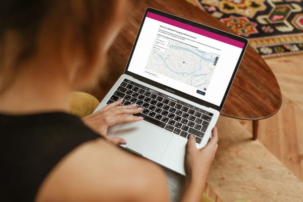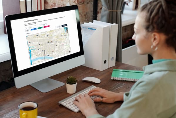
This really moves into uncharted territory; there aren’t any solutions that exist. How on Earth do you make an interactive map accessible to someone who can’t see what they’re up to?
Delib is pretty hot on accessibility. Our three products, Citizen Space, Simulator and Dialogue, are all WCAG 2.1 compliant, and we go above and beyond the baseline requirements wherever we can. Our tech should be nice to use, not simply usable, for everyone, whether they’re an able-bodied citizen or a site admin who relies on assistive technology. It’s built in to the ways in which we work. We’re passionate and knowledgeable about accessibility and we’re rather good at making sure we work in accessible ways.
When it came to building a geospatial capability for Citizen Space, however, there were some pretty unique challenges involved. So we drafted in some extra help.
Léonie Watson is the founder/director of Tetralogical, a web accessibility consultancy. Tetralogical was founded in 2019, but Léonie has been doing web accessibility things since the internet was young in the late 90s – coincidentally about as long as Delib has been doing digital democracy things.
She has an impressive job history, including a stint at the Government Digital Service in its early days, and authored many of the GDS accessibility resources that are drawn on by people and organisations all around the world. So she was well-placed to help us answer the (we hope) million-dollar question: How do you make an interactive map, something that is uniquely biased towards sighted and able-bodied people, actually accessible?
I interviewed her over video chat to talk about her work with us and how she helped us tackle this particular puzzle.
*
Delib’s stance has always been that accessibility should be built into a product, not added or botched together as an afterthought. For our other tools, building in accessibility features has been relatively straightforward: keep text at a readable size, offer a plain-text version, maintain acceptable contrast levels, ensure compatibility with assistive software, and so on.
But Citizen Space Geospatial is somewhat different: to engage with an interactive map, you need to be able to see where you’re dropping a pin or drawing a shape, and you also need to be able to use a cursor to draw said shape.
“Making a passive map accessible – for example, where you just want to show someone how to get to your office – is reasonably achievable,” Léonie says. “People like to put maps on their websites to help people find their offices, to choose a place to live or find a plot in an area of ground so that’s come up periodically throughout my career. But something like this really moves into uncharted territory; there aren’t any solutions that exist. What do you do when you’ve got someone [blind] like me who was trying to choose a plot of land for which they want to apply for planning permission? How on Earth do you make that accessible to someone who can’t see what they’re up to?”
![An example of the text input for the 'draw a line/route' activity type. Text reads:
'This map shows the existing cycling routes in Lambeth Borough.
It shows:
the TfL Cycle Superhighways
the TfL Cycle Quietways
the boundary of the Lambeth Borough
Please describe the routes you think should be upgraded or leave your phone number and one of our team will call you to transcribe your route suggestions.
Please describe the route(s) [text input field]
Telephone number [text input field]](https://res.cloudinary.com/delib/images/w_1024,h_818,c_scale/w_1400,c_limit/f_auto,q_auto:good/v1649421989/newsroom/respond-line-desktop-text/respond-line-desktop-text.png?_i=AA)
Historically, the whole of the planning sector has been very exclusive. The vast majority of Call for Sites exercises require a respondent to print out a paper copy of a map and draw on it to illustrate their proposed site; planning applications and consultations rely heavily on illustrations and printed documents or PDFs which are by nature inaccessible to anyone who can’t see.
What we are doing on a base level is creating a digital version of this process. And it turns out that, when it comes to trying to solve the problem of removing the barriers to participation in planning matters for people with disabilities, we’re pretty intrepid in our mission, which is both exciting and slightly concerning for the upcoming geospatial revolution-apparent. But if we are to set a national precedent for making digital place-based democracy inclusive, we’d better nail it. No pressure.
“It was great working with the Delib team because you fall into the category of people who are genuinely trying to solve a problem, and you’d already put a lot of time and thought into how to make mapping information more accessible. It’s always really nice when I can talk to people who’ve considered different angles already and have made some serious progress.
It was great working with Delib because you are genuinely trying to solve a problem, and you’d already put a lot of thought into how to make mapping information more accessible.
“What we did during the consultancy was look at some of the cases where Delib’s clients use maps in their sites, and looked at some of the challenges there. Initially we looked at surface level accessibility: so for example the use of colours, and not depending on a colour as the sole means of communicating information; and if there’s text, which there often is in maps, how you could make that both legible in its default state and flexible so that it can be increased in size. Then you’ve got the more engineering level of accessibility where assistive technology and screen support kicks in: how do we make actual meaning out of the dots on a map, or how do we define areas?”
“And then the biggest challenge is how do you make a map accessible when someone needs to do something to it? The act of selecting an area is probably one of the hardest ones to solve because there are never going to be easy ways to do it.”
One of Tetralogical’s suggestions was to provide a text-based alternative: users can enter a specific postcode and/or set of coordinates, which if required can be followed up with a phone call or other intervention from the consulting organisation to confirm and complete the submission with the respondent. This is the solution we chose. We put links in the map viewer that enable the respondent to toggle between text and visual input.
We could have spent an additional year developing an interactive map that could be navigated with a screen reader or via keyboard input, but the end result would likely have been so complex that it wouldn’t have been worthwhile for the user.
At the end of the day, the most inclusive option is always the one with the path of least resistance for its user, and that’s the route we chose: to build true inclusivity rather than strictly technical accessibility.
Introducing place-based engagement with Citizen Space Geospatial
Include maps and geospatial data throughout your consultation and engagement activities.
Find out more about Citizen Space Geospatial.
We’re confident that Citizen Space Geospatial solves a lot of problems for a lot of people. But who defines those problems and how specifically do you solve them?

Citizen Space Geospatial was designed based on user research involving over 20 government organisations. You can read about the user research journey here.

How did we go about building Citizen Space Geospatial? What were the challenges? You can read about the engineering journey here.

What is geospatial data? Why is it important for democracy, consultation and engagement activities? Read a detailed overview.
To find out more about Citizen Space Geospatial book a demo and we’ll walk you through it.